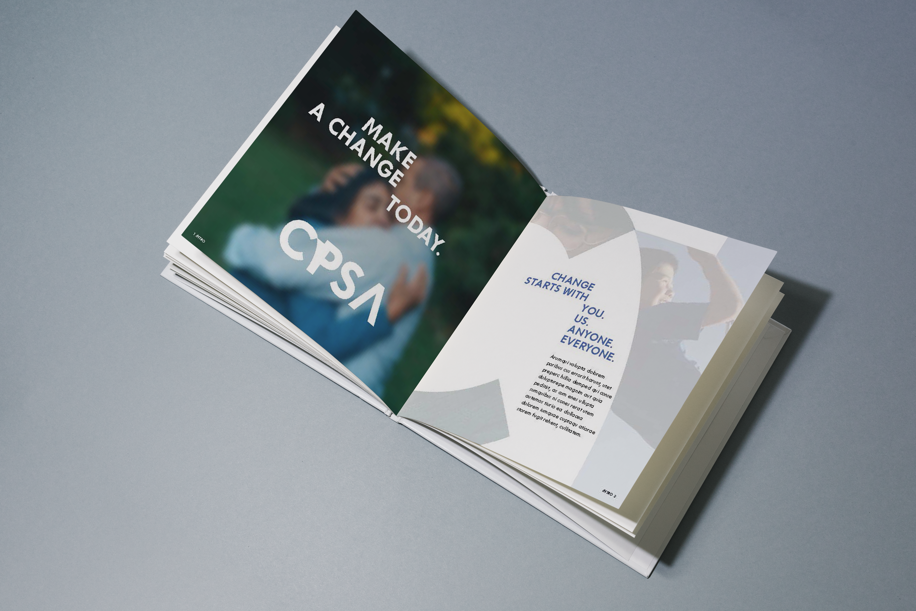
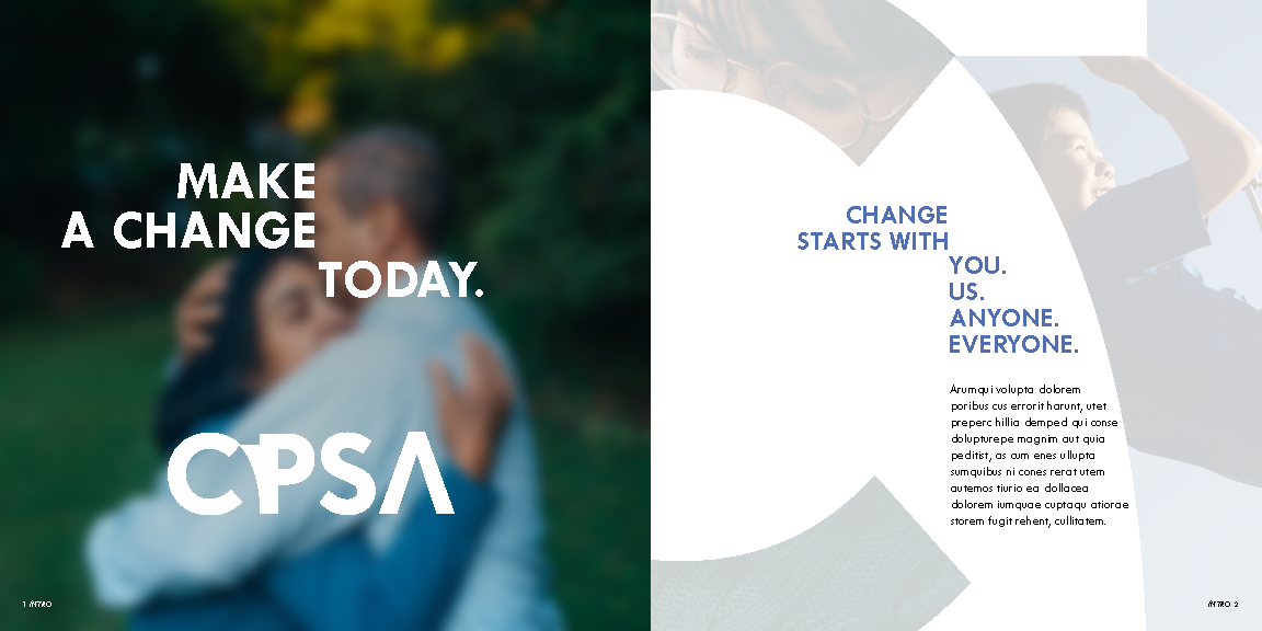
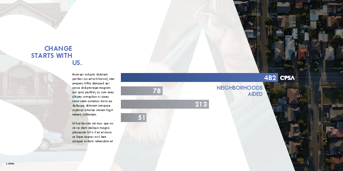
The challenge of this project was to establish a "look" by using certain typographic habits, photographic or image similarity, and grid relationships. Comprised in 2 parts, the biggest challenge was to create a strong enough look that could stand in multiple settings-- such as an ad campaign, an informational book, or a website.

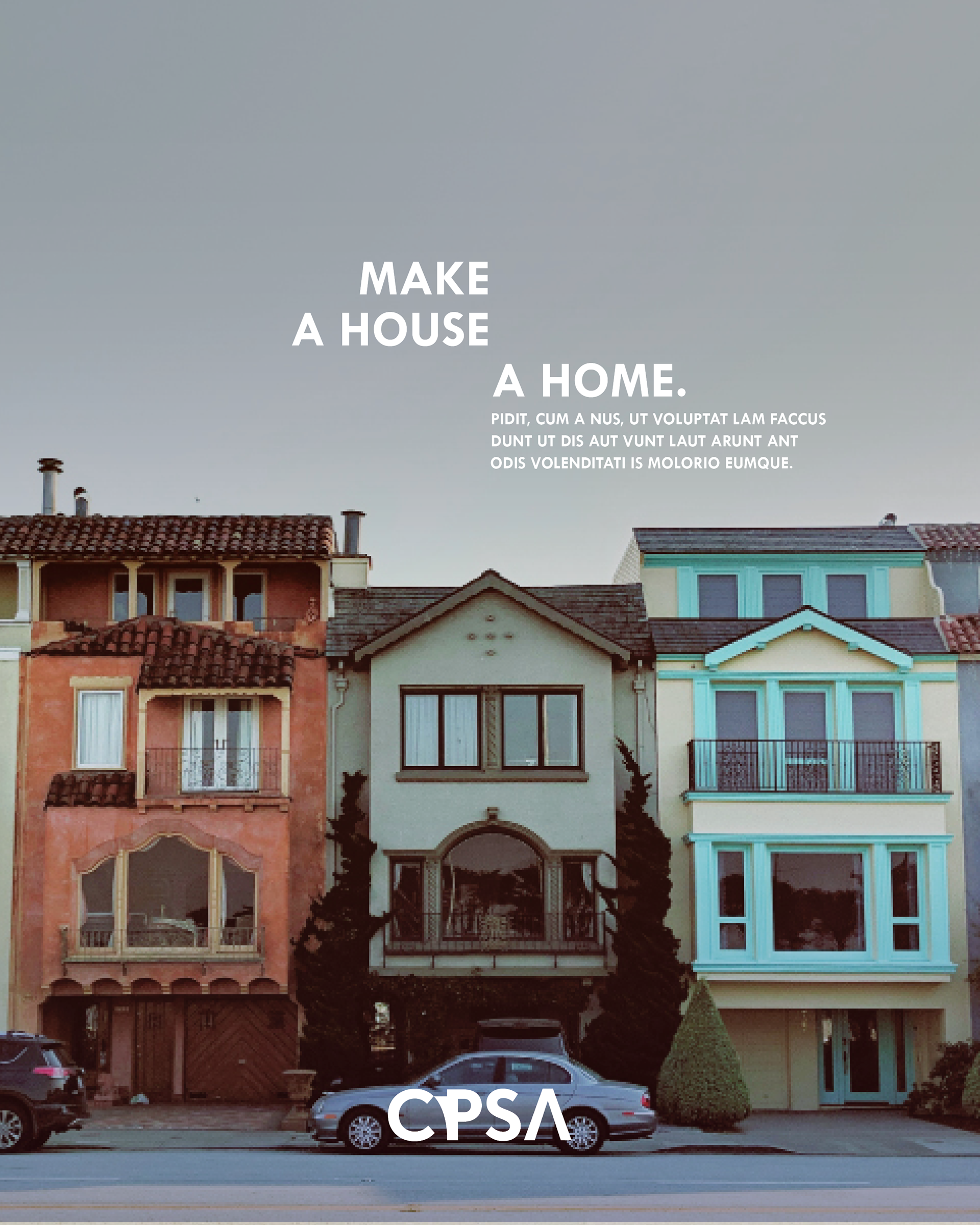
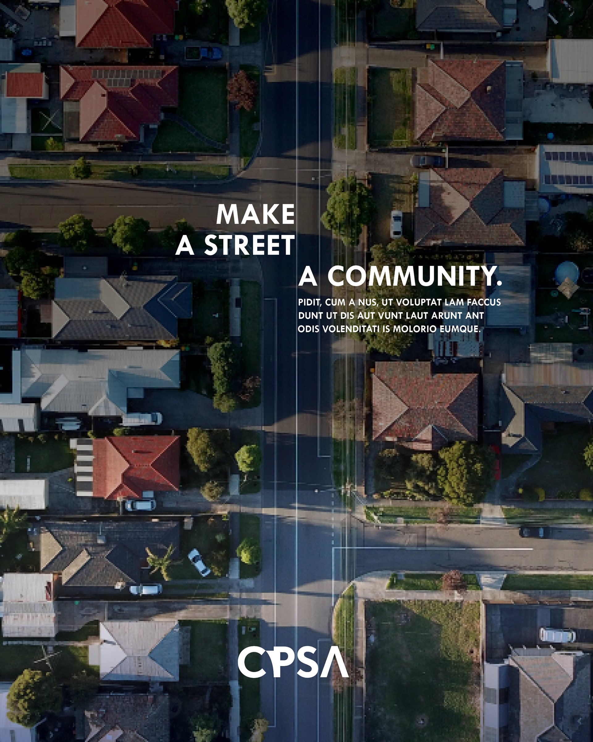
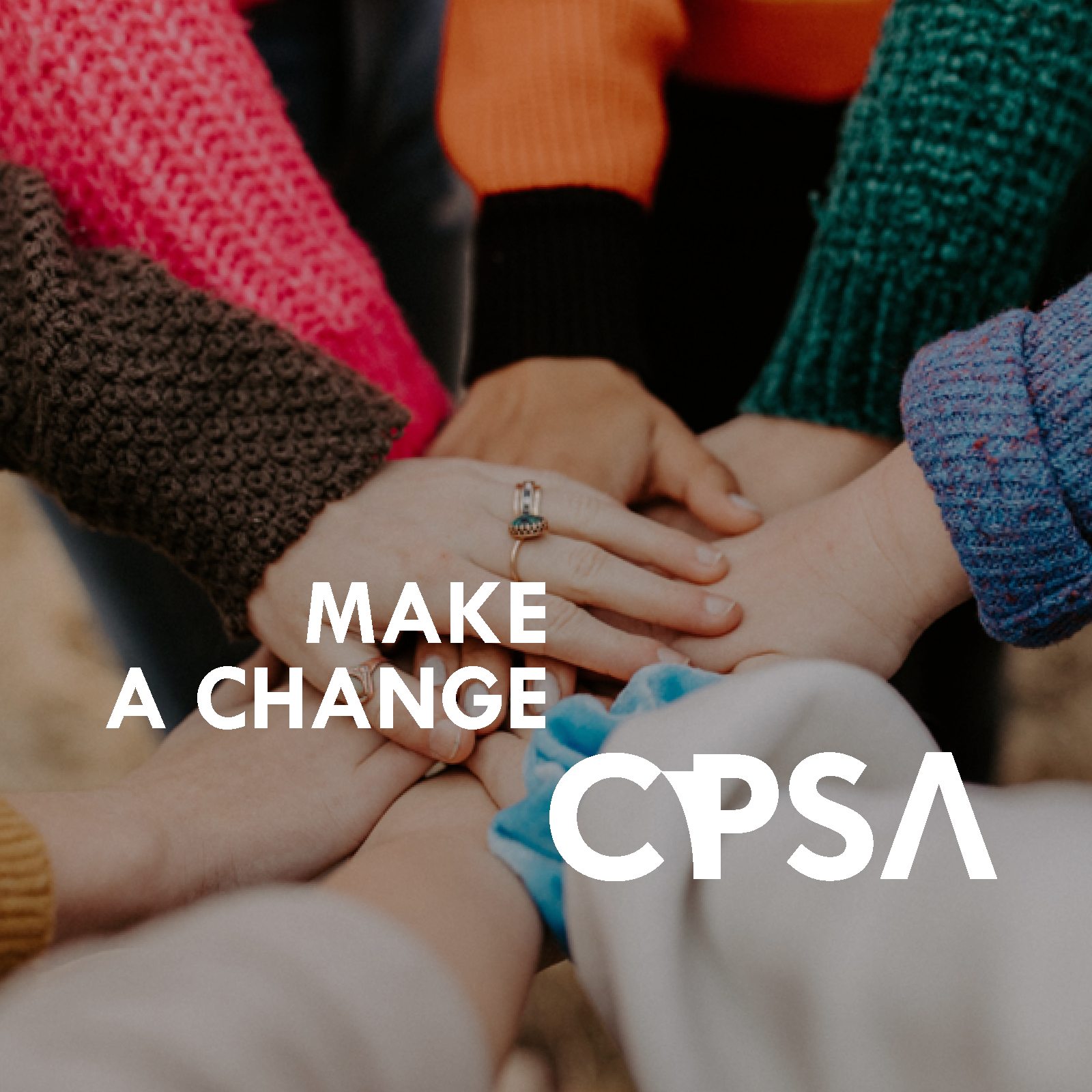
The ad campaign set the standard for the book. The design itself focuses a lot on balance, with photos holding a certain amount of symmetry and balance. The offset text ended up creating a unique visual shape that ended up being the cornerstone to the design, and pushed for the idea of creating something from what is already there.