Ohio Valley Wrestling Brand Design
Located in Louisville, KY, Ohio Valley Wrestling stands tall as an historic pillar in the professional wrestling world. Our goal is to revitalize and distinguish this historic wrestling promotion among its competition.
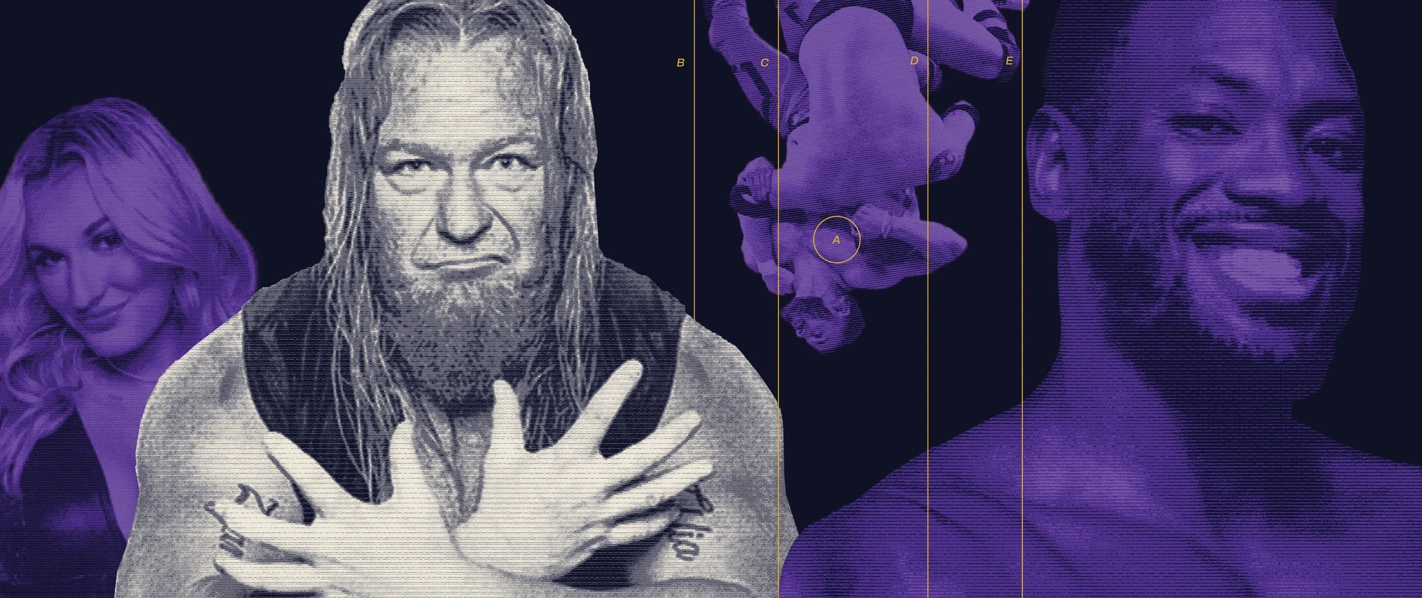
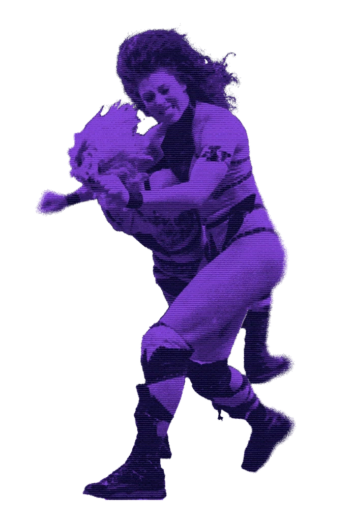
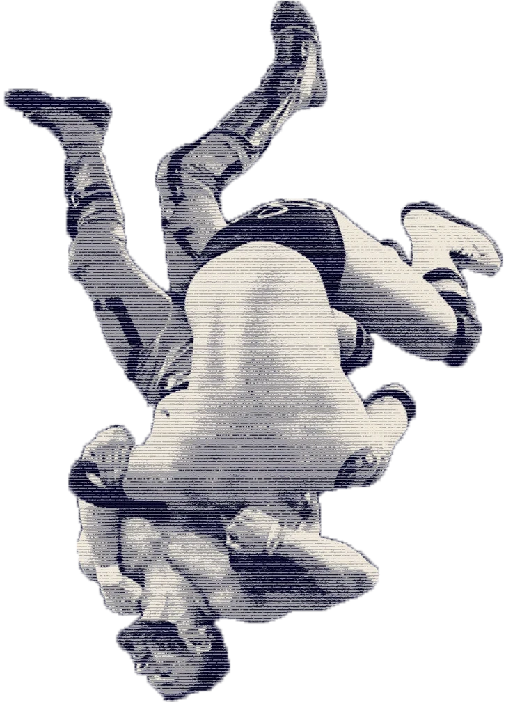
Our choices resulted in a style that is gritty, compelling, and instantly recognizable. Our images mimic the appearance of old TV programming, nodding to Ohio Valley Wrestling’s rich televised history. Its gritty texture continues to connect with its primary audience of middle-aged men without excluding a newer, younger audience the company hopes to connect to.
All images are photographed by Pamela Barnett (@wrestlingphotog on instagram) and LLoyd Thomas (@lloydthomasphotography on instagram). All other photos were sourced from the Ohio Valley Wrestling website and social media.
Color and Image Style
Our redesigned system needed to stay true to the core of Ohio Valley Wrestling, which lies in its wrestlers. With a huge focus on image style, we had to find a way to balance a recognizable image style with the individuality of each wrestler.
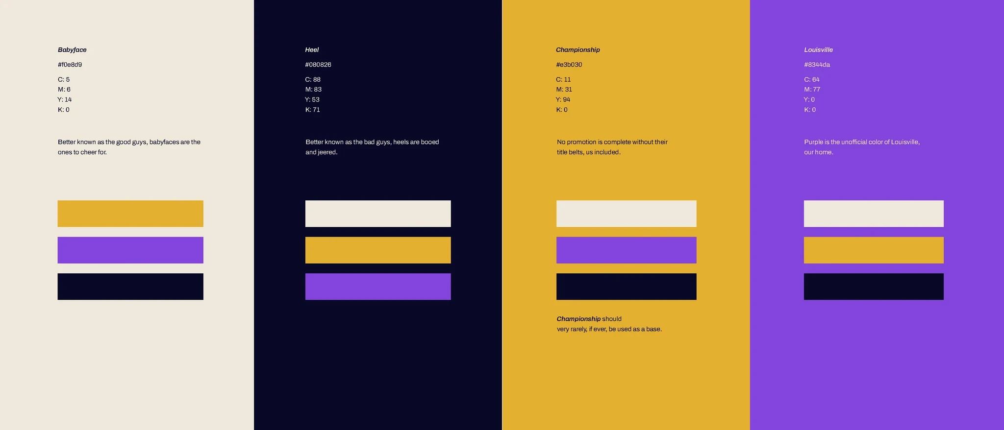
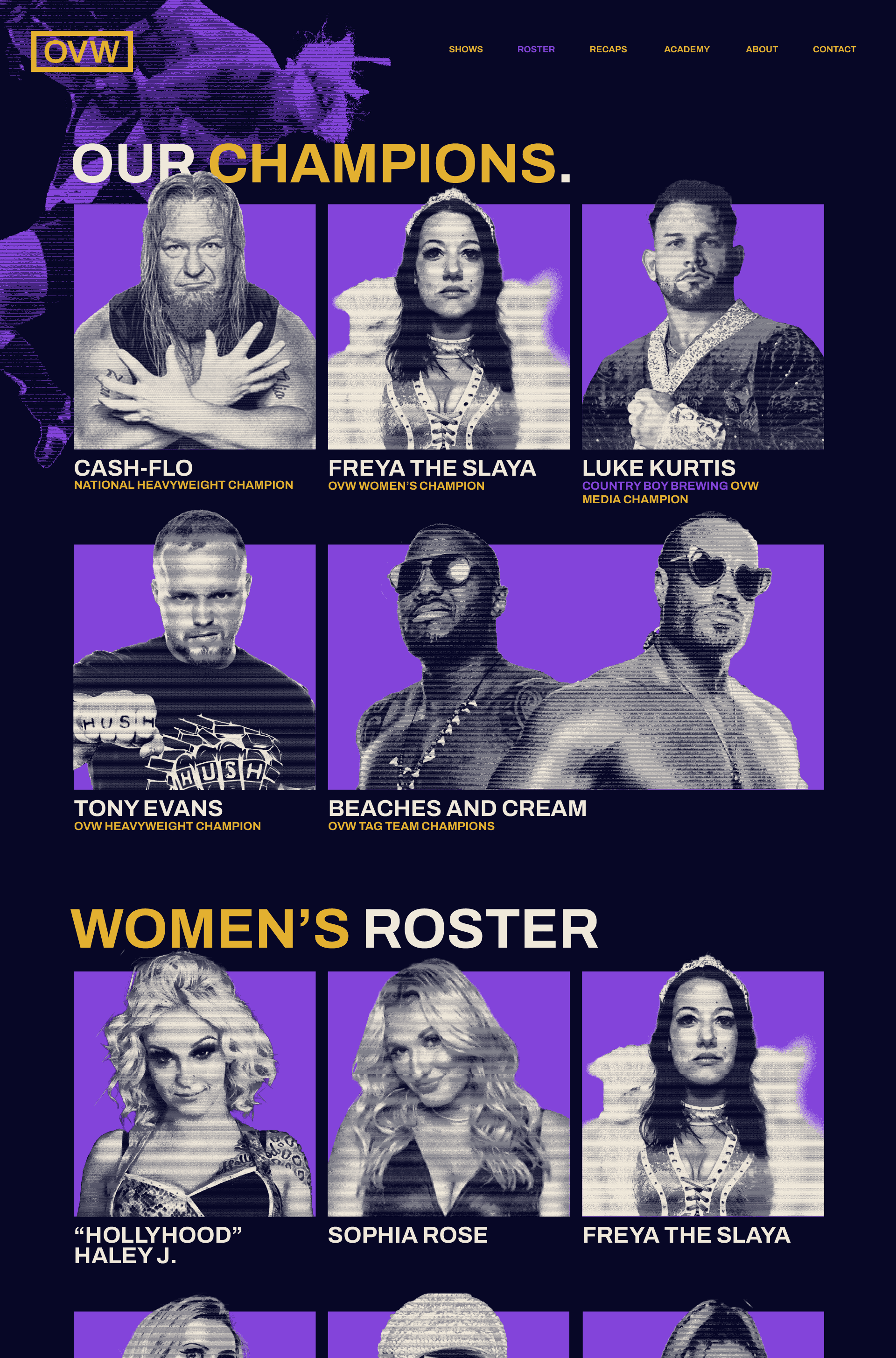
Our colors are minimal and simple, and each color is inspired by a vital part of wrestling, which includes faces, heels, championship belts, and our home, Louisville.
Our system is also flexible enough to change these colors when needed. For certain events, holidays, and show locations, purple may not be the most appropriate color. We have the room to alter this purple for special events when needed, as long as it works alongside our other colors, and purple remains the main color of our home shows.

Our image style is the same for both portrait and full body photos. The style is heavily inspired by the long standing history of OVW, which has been around for 30 years. The classic lines of CRT TV's are present in our images, and allow our photos to feel gritty, compelling, and unique to our competitors. It also allows for more flexibility with our photography, which may occasionally be blurry or distorted by ropes (and thus need to be edited).
Website
Our website acts as a major deciding factor in whether a new fan will decide to come to an OVW show. As such, we need our website to be bold, easy to use, and inviting. We want our homepage to be simple and straight to the point, with color coordinated sections leading people to both our future and past shows. We also need it to be easy to use schedule. It's important for us to keep our website up to date, which includes a short recap to help remind current viewers, or act as a launching point for new fans.
Our wrestlers are highlighted on our roster page. Just like our landing, it's incredibly important to keep this up to date. Our champions are highlighted first, then our main roster, which is divided into the men's and women's divisions. For wrestlers who are participating in OVW on a regular basis, we want to make sure they're present in our roster, both as a show of respect, and to let fans know they're active in our company.

Social Media
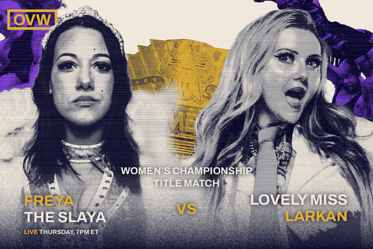
Our social media should be loud, eye-catching, and memorable. Due to the nature of a majority of our posts being match-ups, we allow more creative freedom in this department. In general, we want a lot of layers, bright pops of color, and more distinguished post-individuality.
For video based content, which is also often posted on our social media, we don't need to maintain this exact visual style throughout the whole video, but instead leave touches of it through texture, logo placement, and production quality.


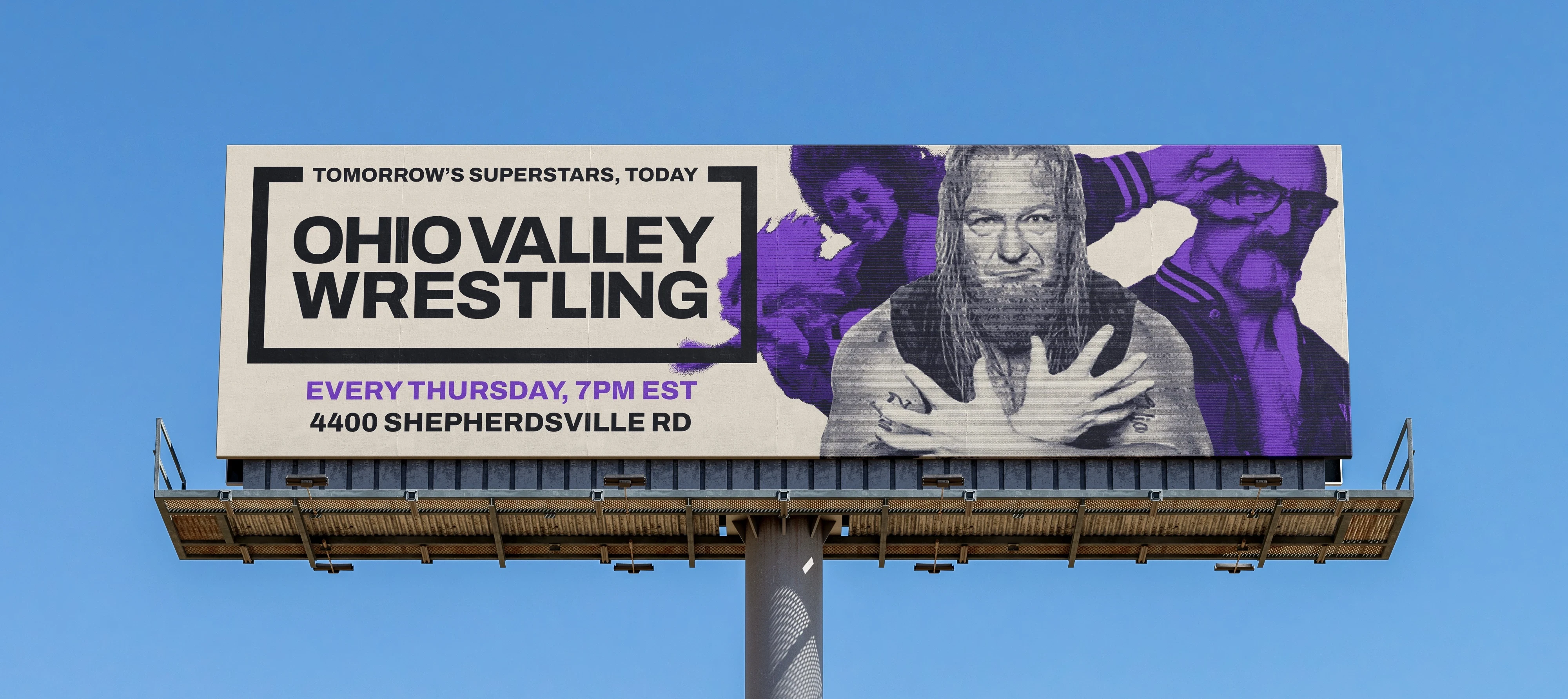
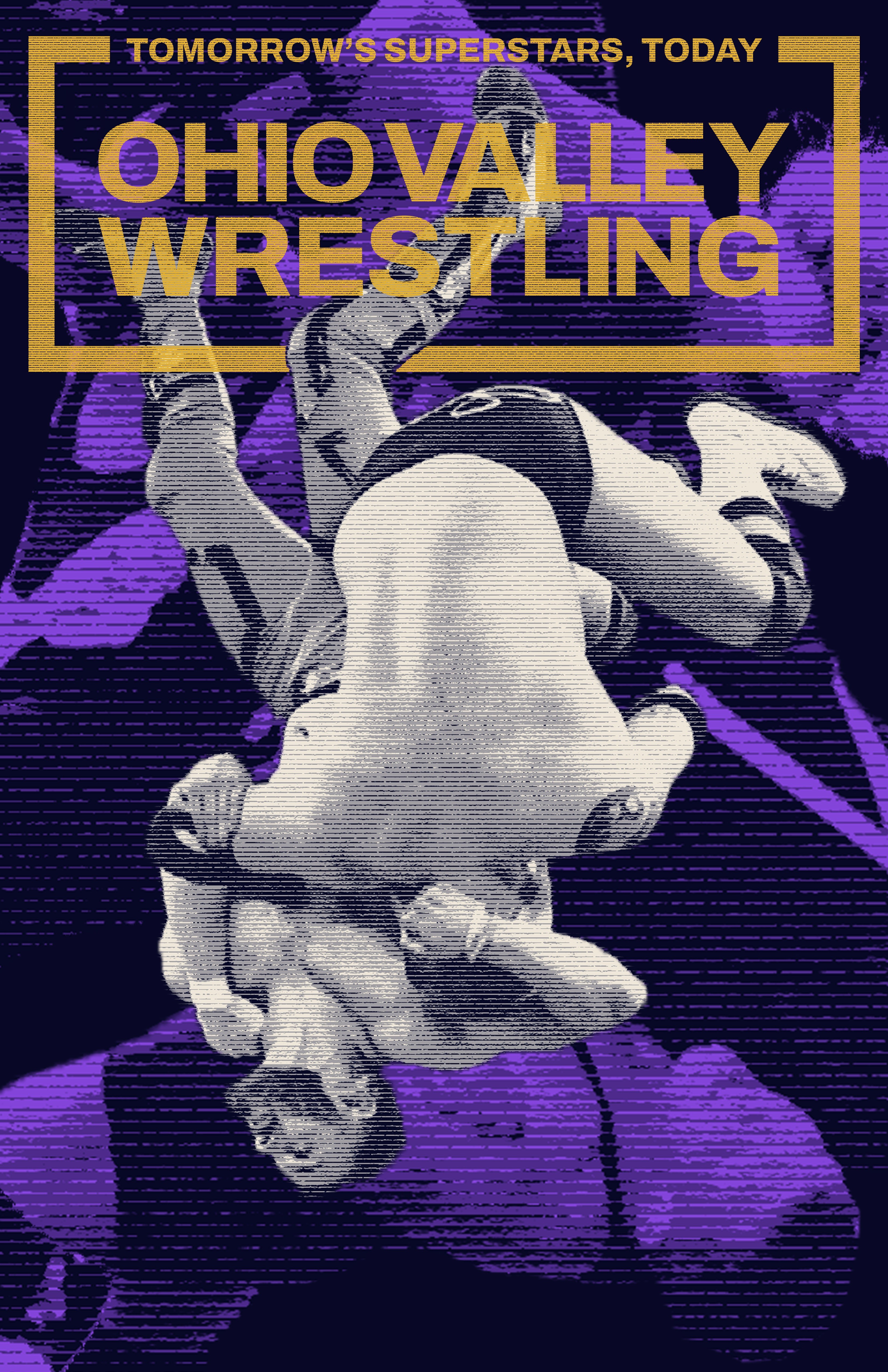
Print Material
Print material is crucial to our brand. From flyers to posters, to even billboards, we need our printed material to be eye catching and memorable.