All images are photographed by Pamela Barnett (@wrestlingphotog on instagram) and LLoyd Thomas (@lloydthomasphotography on instagram). All other photos were sourced from the Ohio Valley Wrestling website and social media.

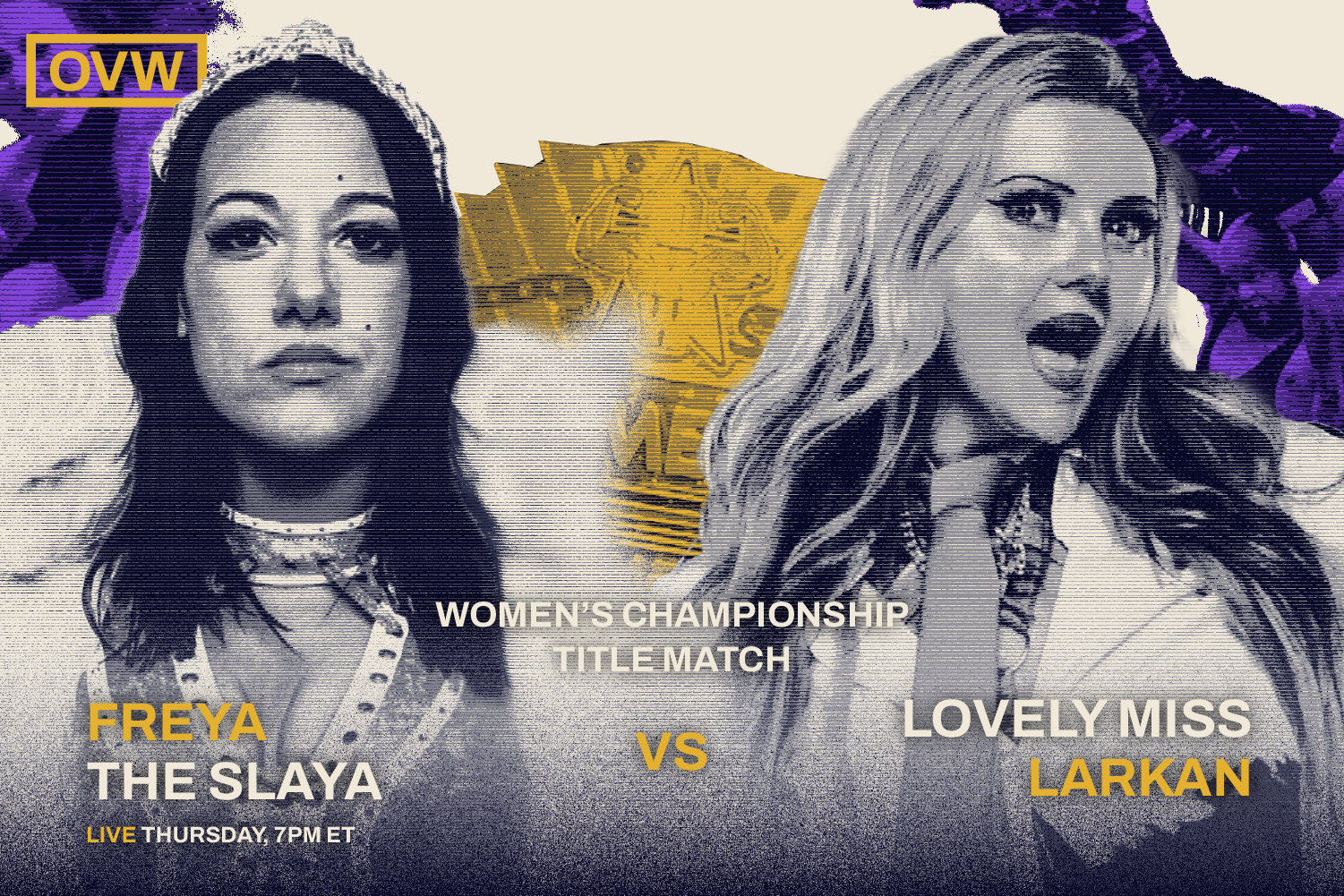
Our redesigned system needed to stay true to the core of Ohio Valley Wrestling, which lies in its wrestlers. With a huge focus on image style, we had to find a way to balance a recognizable image style with the individuality of each wrestler. We chose to limit our palette to five main colors to represent the largest aspects of OVW: heels (bad guys), faces (good guys), Louisville, and the champion’s gold.
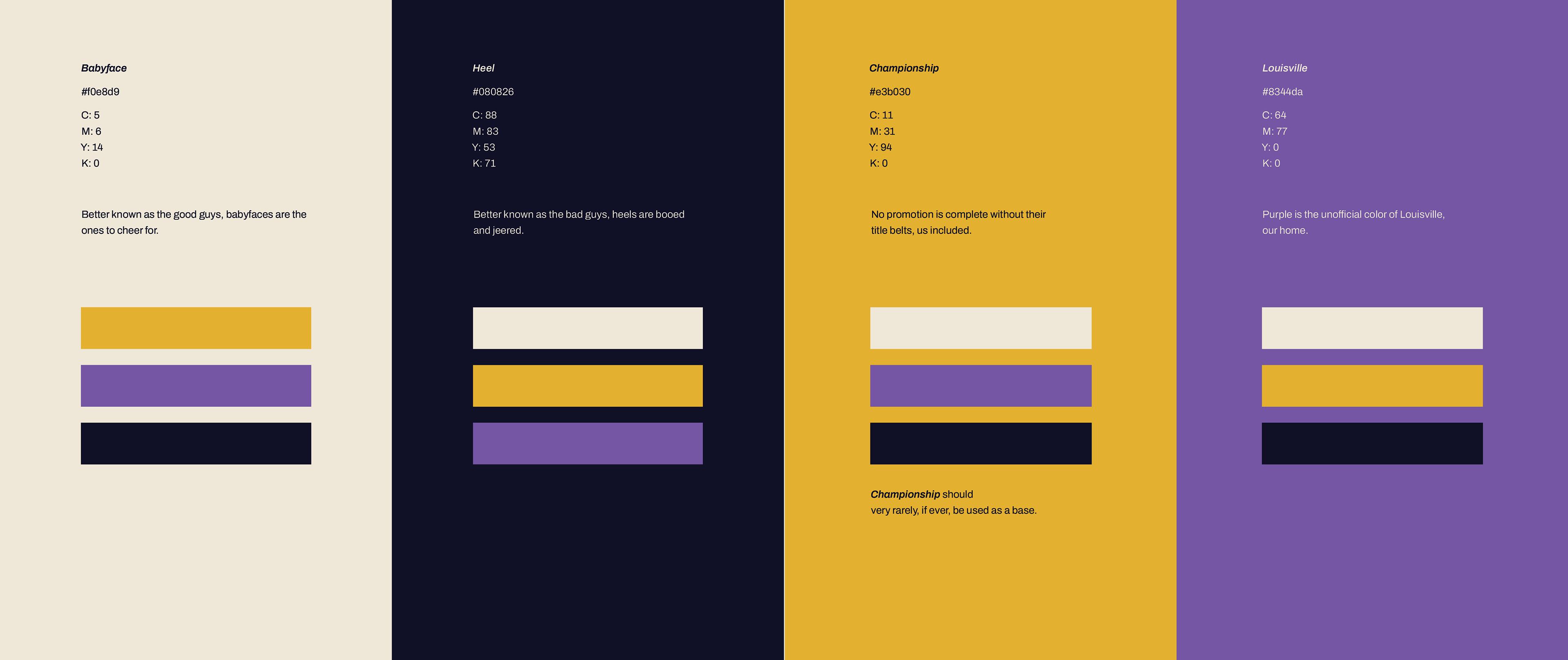
Our choices resulted in a style that is gritty, compelling, and instantly recognizable. Our images mimic the appearance of old TV programming, nodding to Ohio Valley Wrestling’s rich televised history. Its gritty texture continues to connect with its primary audience of middle-aged men without excluding a newer, younger audience the company hopes to connect to. Finally, our logo acts as a stamp of quality– it’s worn and classic, yet its shape retains an air of strength and unity.
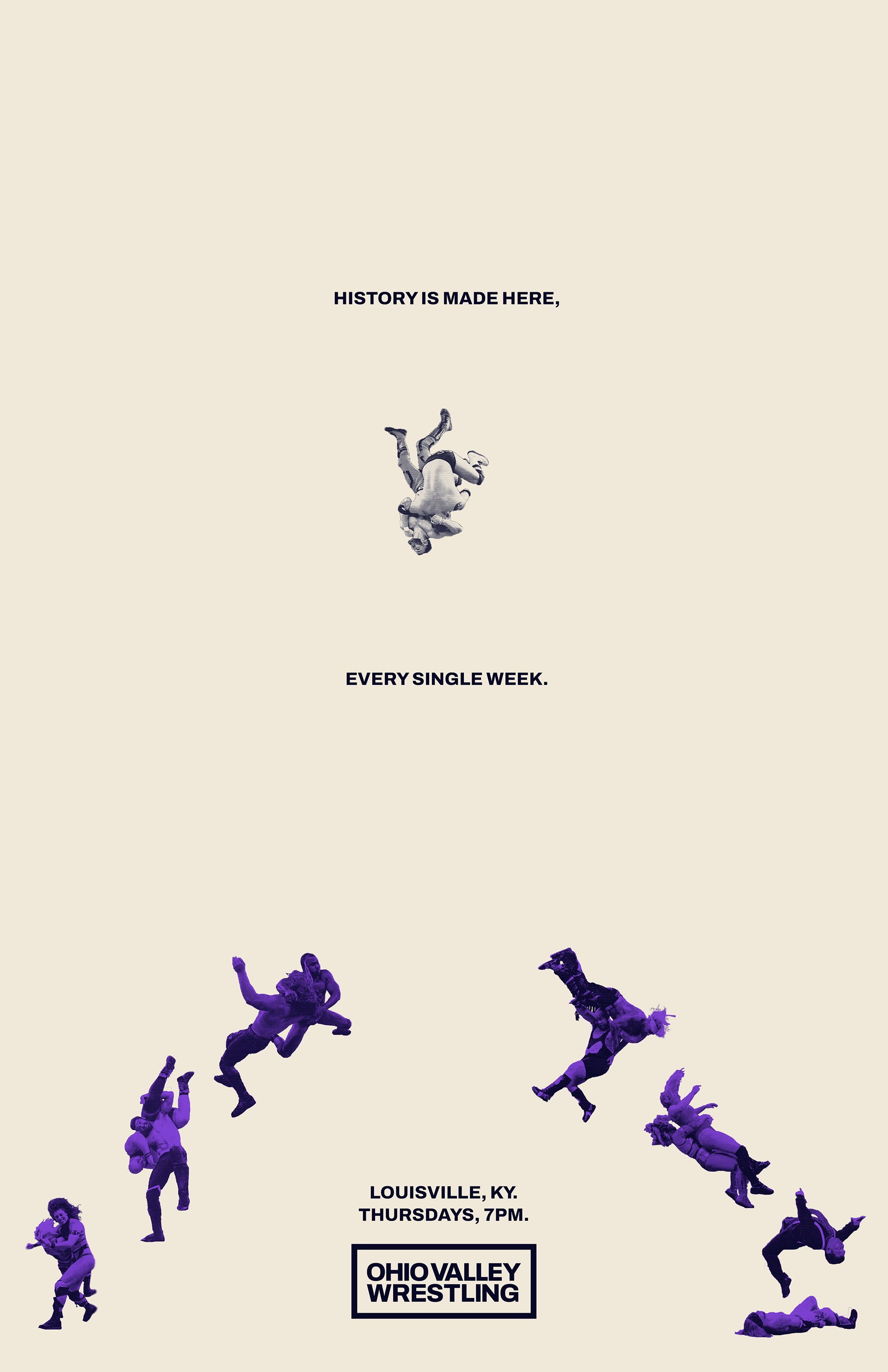
Print Material


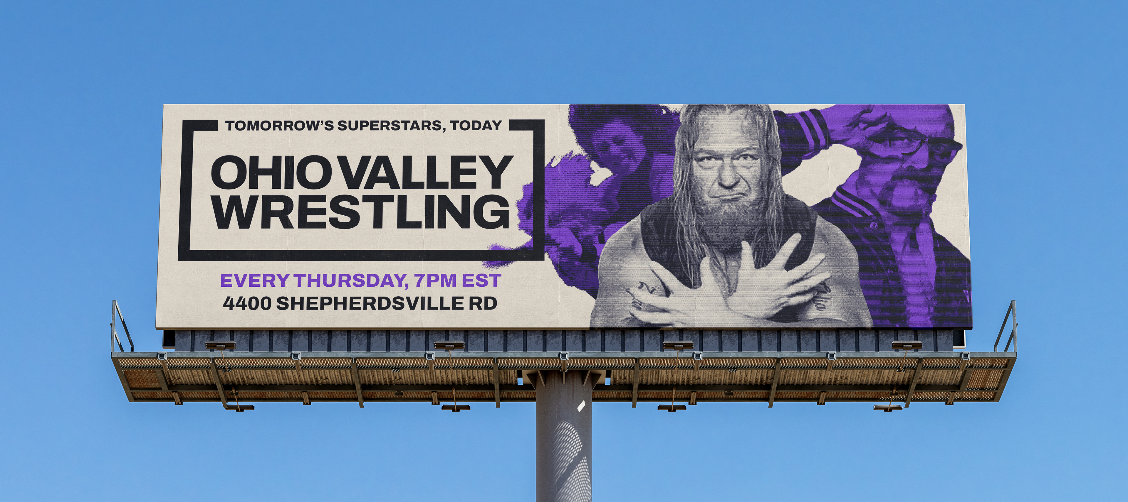
Advertising Campaign
The "Where" campaign utilizes Ohio Valley Wrestling's unique history in the wrestling community-- and is something only Ohio Valley Wrestling can do. This campaign highlights wrestlers who were cultivated by OVW, and went on to achieve huge success. This includes wrestlers such as Randy Orton, John Cena, Bautista, Brock Lesnar, and more recent stars such as Cody Rhodes and CM Punk.
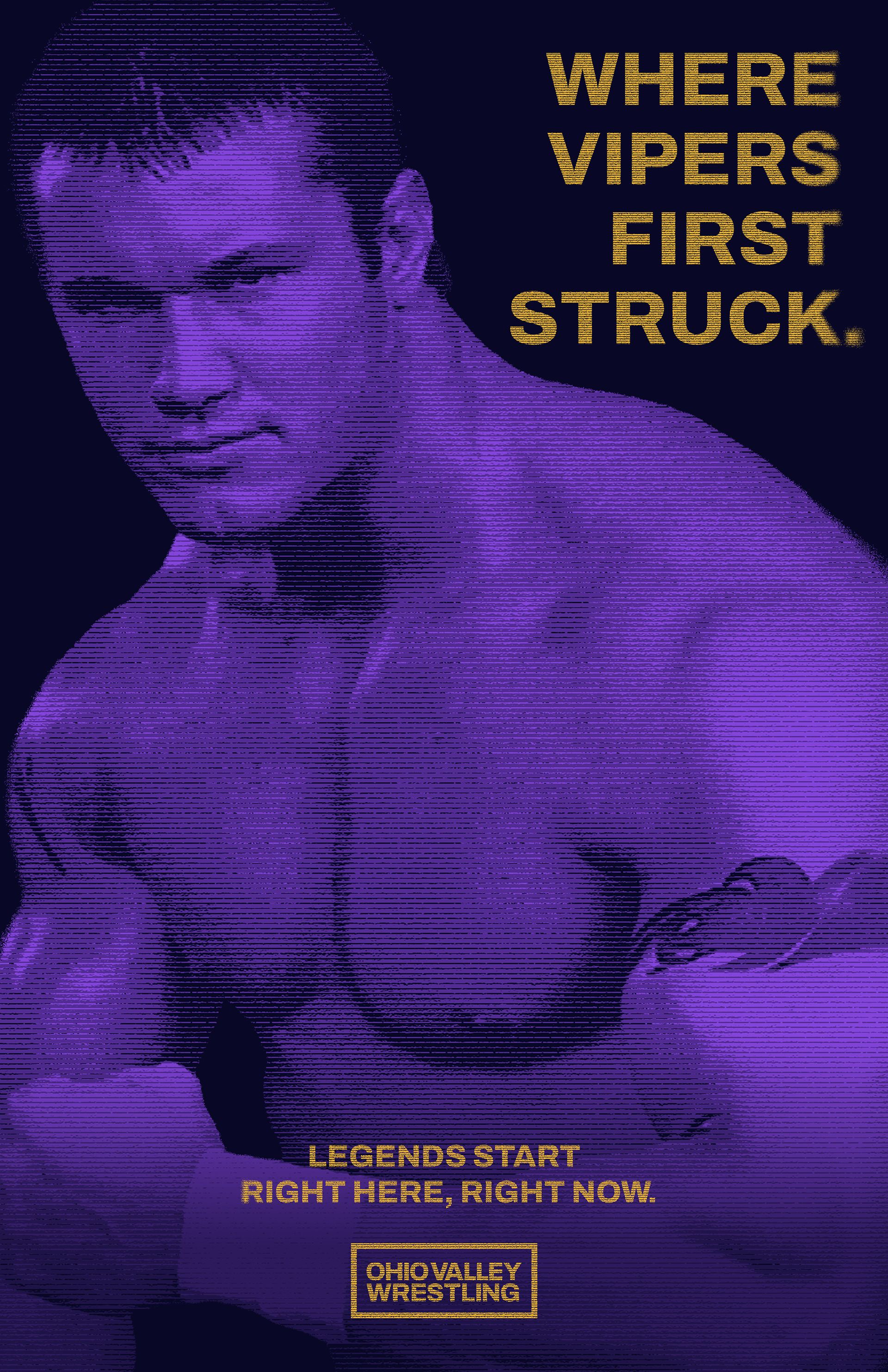
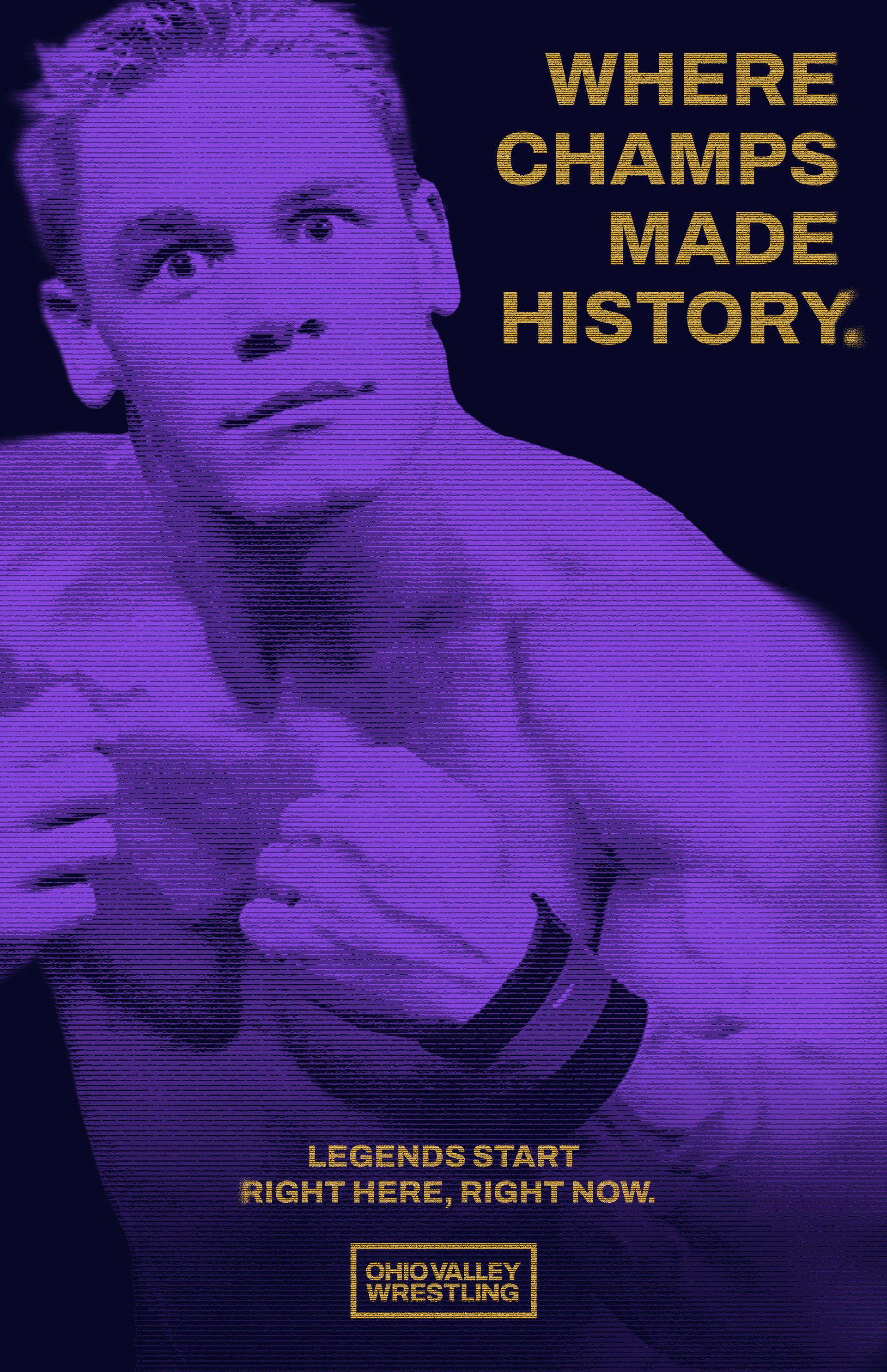
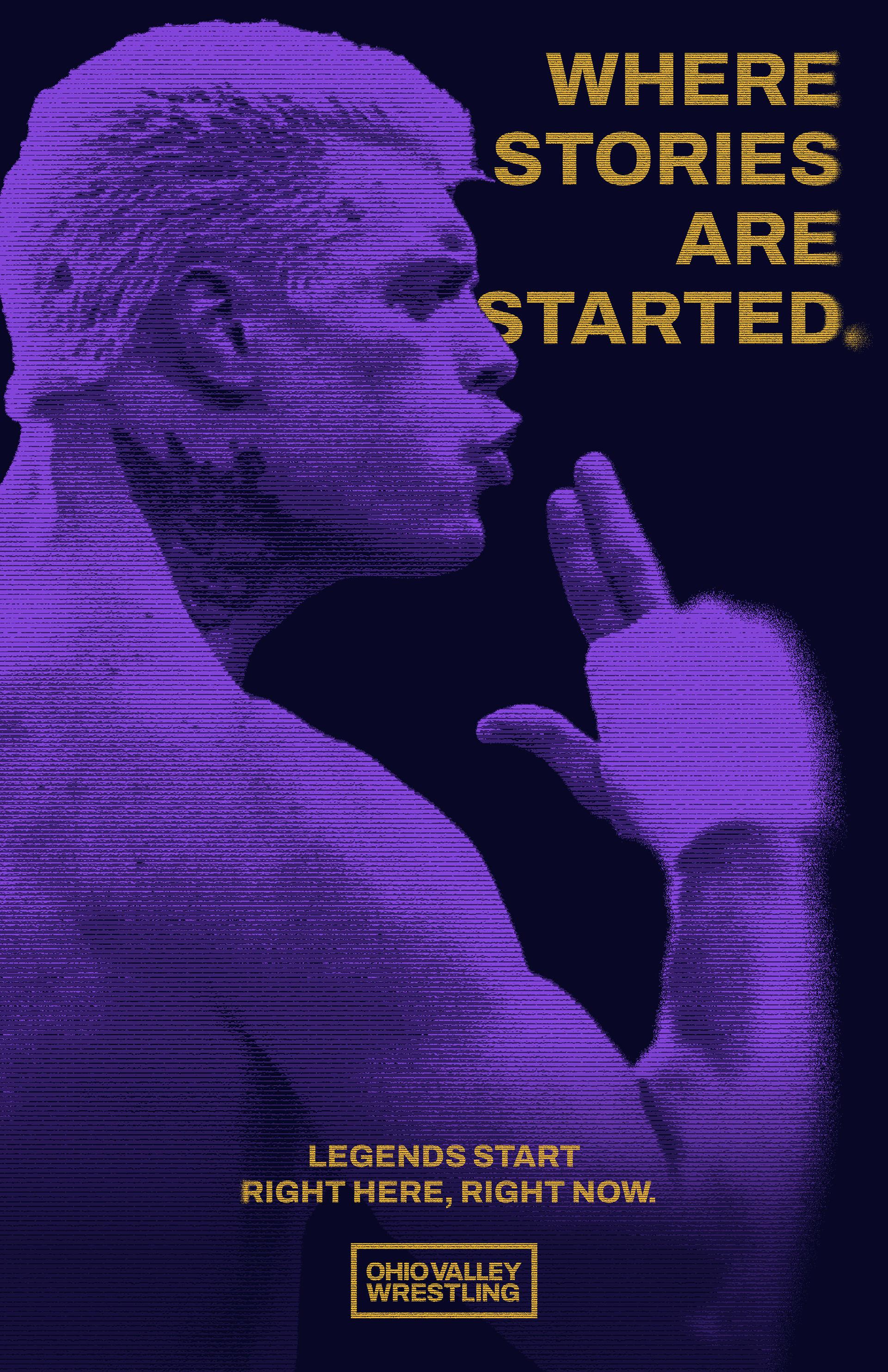
Photo Credit: Getty Images
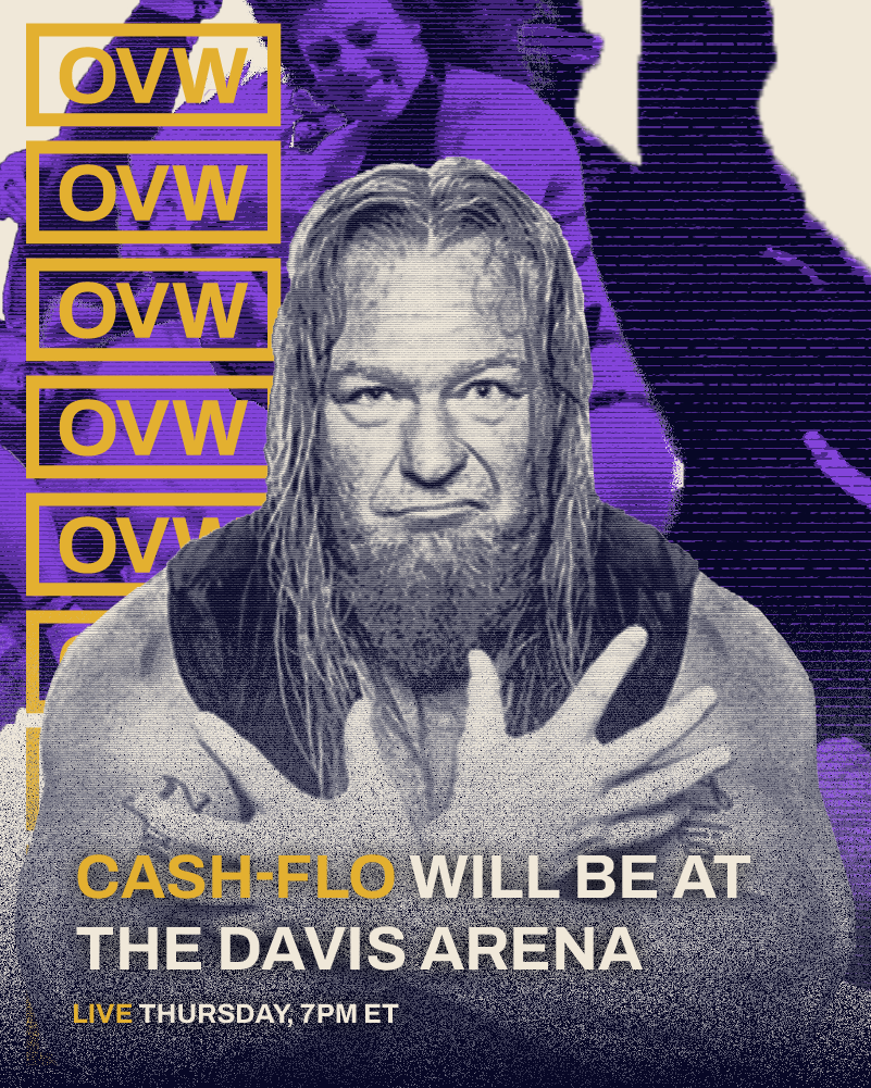
Social Media
Our social media is meant to be fun, vibrant, and a small change from our regular designs.


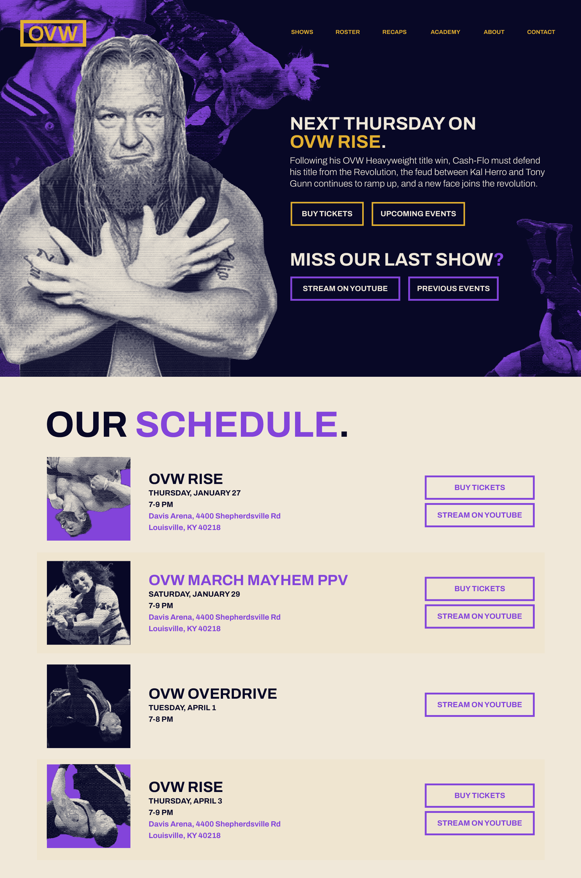
Website